
Friday 25 May 2012
Thursday 24 May 2012
Wednesday 23 May 2012
Complete publication
I have added more content into the publication due to time restrictions I have only applied it to only one of the publication formats, I simply chose my favourite format and continued with that, the content layout has a fairly regimented method throughout the five variations so its fairly easy to imagine what the out come would be if it were applied to another.
Tuesday 22 May 2012
Billboards
I have mocked up some billboards, the boards should be situated in urban areas for maximum exposure to the public encourageing them to find out more about the publication. The billboards are a slight last minute adition to my range after seeing an effective billboard produced by the big issue. This added with the compelling photography I have used from the photographer Lee Jeffries the billboards should provoke a reaction from people as should the publication.
Homeless vector


For no real reason I got in my head that all people in pictures should be vectors, so I made a vector of a homeless gentleman and put him into the some of the pictures of my billboards. Looking back I perhaps did it to illustrate the fact homeless people are somewhat faceless to the majority of people walking down the street, and could be ignored still if sat next to a billboard about homeless people.
Monday 21 May 2012
Publication in context
The publication needs publicising, it needs to have context. This is my attempt at creating that context somewhere for the publication to be sold, somewhere for it to be advertised and so on.


Wednesday 16 May 2012
Homelessonline
I wanted to not only increase the range but the way the publication could be viewed so having a website seems like the logical next step for a modern solution to the problem. I kept the branding and layout similar to the publication purely for visual continuity.


Tuesday 15 May 2012


Thursday 10 May 2012
Cover Ideas
I have been working on a front cover to my publication using logos I had developed previously and the Lee Jeffries photography, I want the focus to be on the imagery with one contrasting element the logo. I discussion with peers I was told that they where not sure about the logo it looked to friendly although they found it aesthetically pleasing, but once I explained that the publication had to be interesting to look at as well as informative, as it will be targeted at people with little knowledge of this issue or indeed do not particularly care about it, they appreciated what I was trying to create and where more on board with the type face I had chosen.
Combining Images and symbols


I have tried combining the symbols i have created to represent the different statistics with photography of Jeffres. This is in the attempt to make the stats more human that there are people behind the statistics, which is an integral part of the publication I wish to create.
Info Graphics


After reading through a document obtained from the Crisis charity website I came across some startling facts and statistics about the lives and deaths of homeless people in the UK I wanted to experiment with trying to turn this into some sort of information graphics to illustrate these issues in a tasteful yet easy to understand way. The reason for doing this is in part due to the graphs in the original document where difficult to understand and I wanted to make this information more accessible.
Homeless publication logo ideas

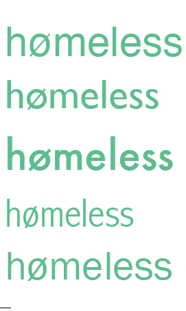


This is some of my initial development for what the logo to my publication could look like. I have tried to look at some different colours, the colours are fairly bright my thinking here is i would like the text to be quite high contrast to contrast with the images I would like to use, images by the photographer Lee Jeffries, the pictures are all black and white.
Tuesday 1 May 2012
Concept and task for next week
1. Research target audience
2. Research into different charities
3. Tone of voice.
4. Research facts and stats.
5. Images.
6. Homeless centers .
7. Charity promo materials.
8. Buy a Big issue.
9. Distribution
10. People who works for charities, Big Issue/ Crisis.
Subscribe to:
Posts (Atom)